CSS Grid Basic Examples
Introduction
This page is meant to show you some of the basic ways in which you can use CSS Grid. There are a lot of ways to size and position things using CSS Grid, which is great, but can be confusing. If you want a more thorough resource that covers all of the terminology, methods, units etc. then there are other resources. Perhaps start with Mozilla Developer Network's guide.
To help you learn how to use the Grid and get a better sense of how it works I suggest clicking the Edit in CodePen link in the upper right corner of the code examples. This allows you to directly edit the CSS and HTML and see what happens when you do. Each example has an extended example that assumes you're doing this.
One way to keep these examples handy is to have a CodePen account (see Before You Start for that). Follow this process for each example and you'll have your own versions:
- Sign in to Codepen
- Click the Edit in CodePen link
- Click to fork the project
- Click to save.
Before You Start
There are two things that will be helpful to have before you start using this page:
-
A CSS Grid Compatible Browser. Right now the latest versions of most browsers support CSS Grid. See the Can I Use page for up-to-date information.
- A CodePen account. You can either go to the site http://codepen.io and sign up or you can sign in through your GitHub account. I recommend the GitHub account method and if you're in the web field and not on GitHub, then sign up: https://github.com.
Example 1: Equal Columns
This is a simple but powerful part of CSS Grid. In float-based layouts you have to use percentages to spread columns across the page. For example if you wanted four columns to share the page you would have to set the width of each to 25%:
width: 25%;
Then if you decided you wanted five columns you would have to go to all of the elements and change their width to width: 20%;.
Some numbers like 3 columns didn't quite fit percent (33.33333%).
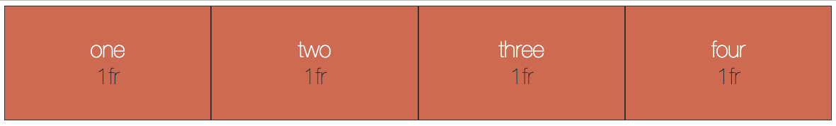
CSS Grid is different in a few ways. The first big difference is that you specify the width of columns, not individually on each element. Below is an example of making four equal columns using the percent.
.grid-container{
    display: grid;
    grid-template-columns: 25% 25% 25% 25%;
}
If you want to add another column then you would just add another number to the grid-template-columns. grid-template-columns: 20% 20% 20% 20% 20%;
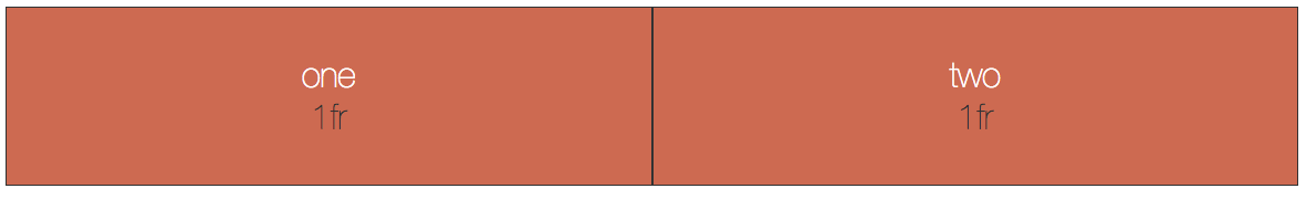
With CSS Grid we also now have another big change, the fractional unit: fr. This makes adding columns even easier and the math involved is simpler. Here is a four column layout
.grid-container{
    display: grid;
    grid-template-columns: 1fr 1fr 1fr 1fr;
}
To change it to five columns you just add a fifth one to the end grid-template-columns: 1fr 1fr 1fr 1fr 1fr
Fr works by adding all of the fractional units together and diviing the available space among them.
Try the example below. Remember that if you add more columns in the CSS you will also have to add more elements in the grid (See Extends Example 1 below).
See the Pen Basic CSS Grid: Equal Columns by Christopher Stein (@profstein) on CodePen.
Extend Example 1
Try extending this example by adding more columns.
- Click Edit in CodePen. Then click Fork and save if you want to keep a copy.
- Copy the second box:
Paste in the box two or three more times. You can change "two" to keep track of how many section.box elements you have.
As you paste them in CodePen you should notice that the new boxes keep the two column structure.
- In the CSS edit line 7 to add more grid-template-columnsby adding
1frfor each column.If you match the columns and boxes they will spread equally across the page.
Example 2: Mixed Column Units
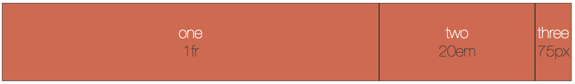
You can mix and match different units for your column widths. You can also do that for rows as well. In this example the first column is a fractional unit, the second is set to 20em and the third at 75 pixels.The browser will set columns two and three first because they are fixed width and then assign the rest of the space to column one.
Try clicking the CSS tab to show and hide it and you will see that columns two and three stay the same but column one grows and shrinks with the available space.
See the Pen Basic CSS Grid: Mixed Column Units by Christopher Stein (@profstein) on CodePen.
Extend Example 2
Try using different units for the column widths. Just change the values for grid-template-columns in line 7
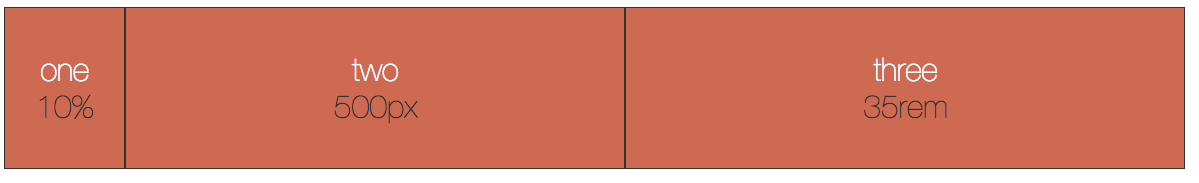
grid-template-columns: 200px 500px 1fr;
or
grid-template-columns: 10rem auto 20rem;
or anything you want. 
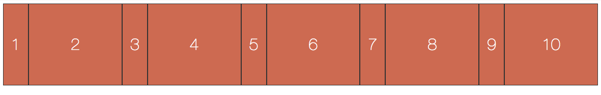
Example 3: Repeating Columns
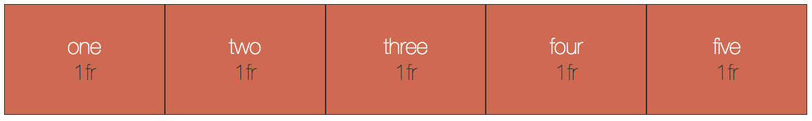
If you want to add a number of columns with the same settings then there is a handy repeat unit. This can also be used for rows.
The format is as follows: repeat(#-of-repeats, value-to-repeat);. So if you wanted 12 columns all of equal width:
grid-template-columns: repeat(12, 1fr);
See the Pen Basic CSS Grid: Equal Columns by Christopher Stein (@profstein) on CodePen.
Extend Example 3
You don't have to repeat for all of the columns. you can mix and match setting a column with repeat. In the example below the two property rules are the same:
grid-template-columns: 200px 1fr 1fr 1fr 1fr 200px;

grid-template-columns: 200px repeat(4, 1fr) 200px;
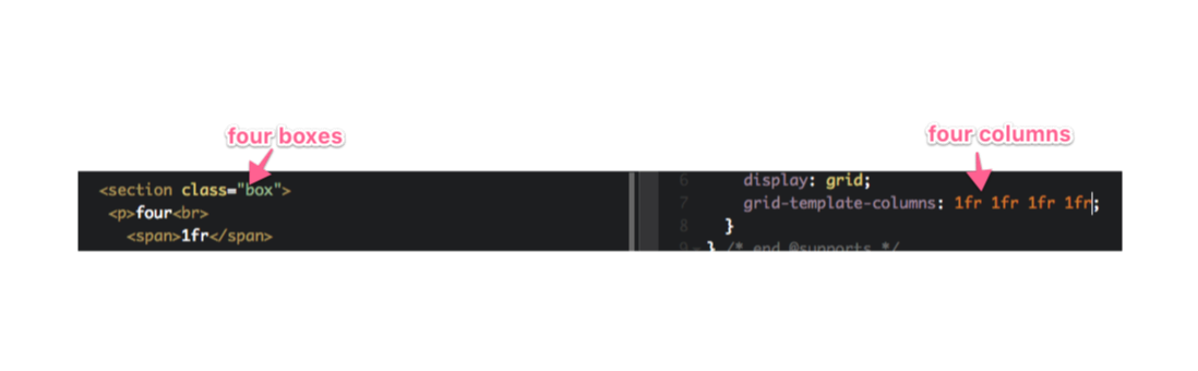
You can also get super fancy and repeat a pattern. The following repeats a two column pattern (50px column then a 1fr column) 5 times so it defines 10 columns. See the figure to the right for an example of the output.
grid-template-columns: repeat(5, 50px 1fr);
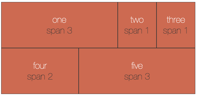
Example 4: Using Span to Span Multiple Columns
By default each grid item is only one column wide. You can style individual items to span more than one column. There are a number of different ways to tell the browser to strech an element over more than one column.
In this example we will look at setting the grid-column property using span. The basic idea is that you select one of the grid items and then set how many columns you want it to span.
.box.one {
    grid-column: span 3;
}
In the example above looks for an element with both box and one classes in it like this
<div class="box one">My Box</div>
IMPORTANT when you are creating classes for your grid item elements, make sure that you hvae different class names for elements you want to span different amounts.
See the Pen Basic CSS Grid: Equal Columns through Repeat by Christopher Stein (@profstein) on CodePen.
Extend Example 4
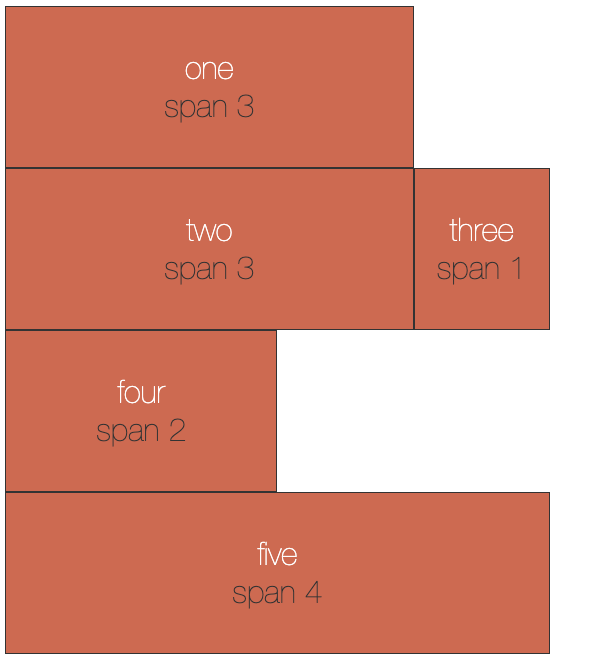
Try adding styles for boxes two and three so that they also span multiple columns. You can also change the amount of columns any of the items span.
Note that if the item spans don't fit neatly into the number of columns (5 columns here) then the item will break to the next row. This can leave you with empty columns (which may be what you want depending on your design).
Example 5: Using Grid Lines to Span Multiple Columns
So far we've only had each element cover one column. There are a number of different ways to tell the browser to strech an element over more than one column.
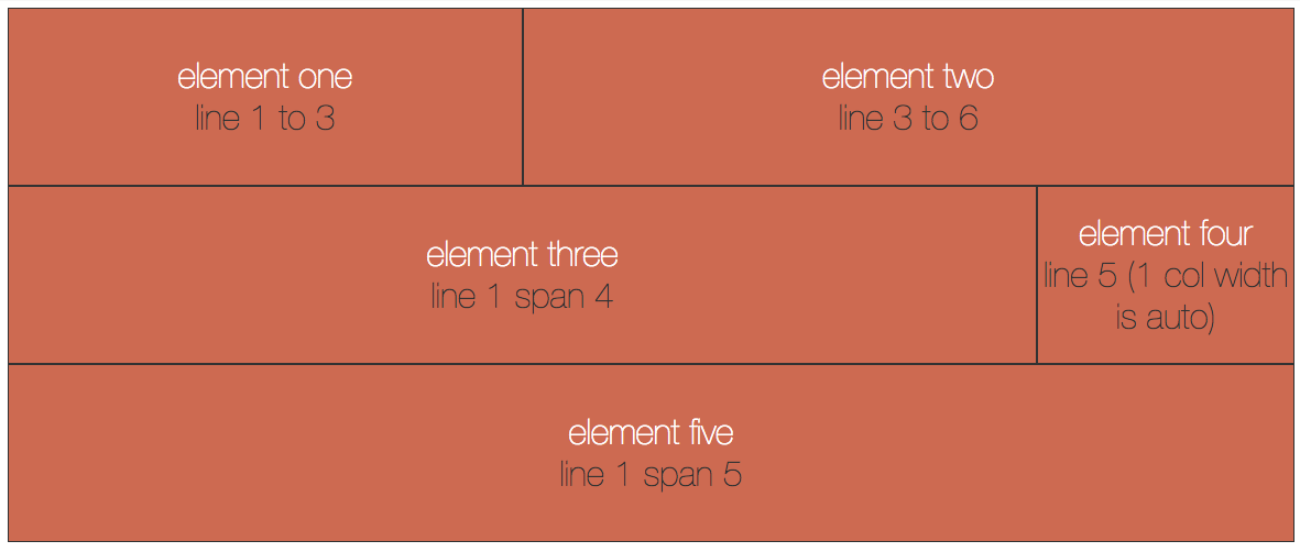
When you add columns the browser will automatically add grid lines for those columns. Because the first line on the left is a grid line, there is always one more grid line than there are columns (the same is true for rows).
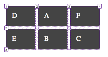
In the example above there are three columns and four grid lines (1, 2, 3, 4 going left to right). There are also two rows with three grid lines (1, 2, 3 going top to bottom).
In order to force different elements to span different numbers of columns we will now have to add CSS for each individual element and define how many columns it spans.
So we have given individual classes to each element this time in addition to the box class which is there for visuals.
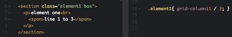
Here is an example of CSS that makes section.element1 span two columns starting at grid line 1 and ending at grid line 3.
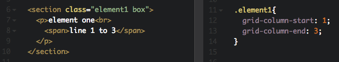
Instead of having to write the grid-column-start and grid-column-end properties each time, you can use the grid-column property and then write in the starting column, a slash (/), then the ending column:
See the Pen Basic CSS Grid: Using Grid Lines by Christopher Stein (@profstein) on CodePen.
Extend Example 5
Try changing around the start and end grid lines for the elments to chane their sizes.
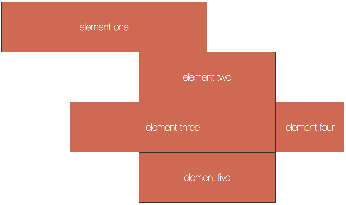
Note that if you overlap them (start a second item in a column the previous item is in) then the overlapping item will move to the next row. This is because we haven't defined rows and they are made automatically. When you define the rows too you can layer elements on top of each other.
See the Figure
Example 6: Adding Rows for a Simple Site
So far we've only defined columns. Now it's time to add some rows. Luckily this is relatively easy. You can add rows using the same syntax as adding columns except you use grid-template-rows: instead of grid-template-columns:
We have also introduced a new unit: max-content. This tells the browser to make the row as high as the tallest piece of content in the row. A row defined this way will grow with its content.
See the Pen Basic CSS Grid: Simple Site with Rows and Columns by Christopher Stein (@profstein) on CodePen.
Extend Example 6
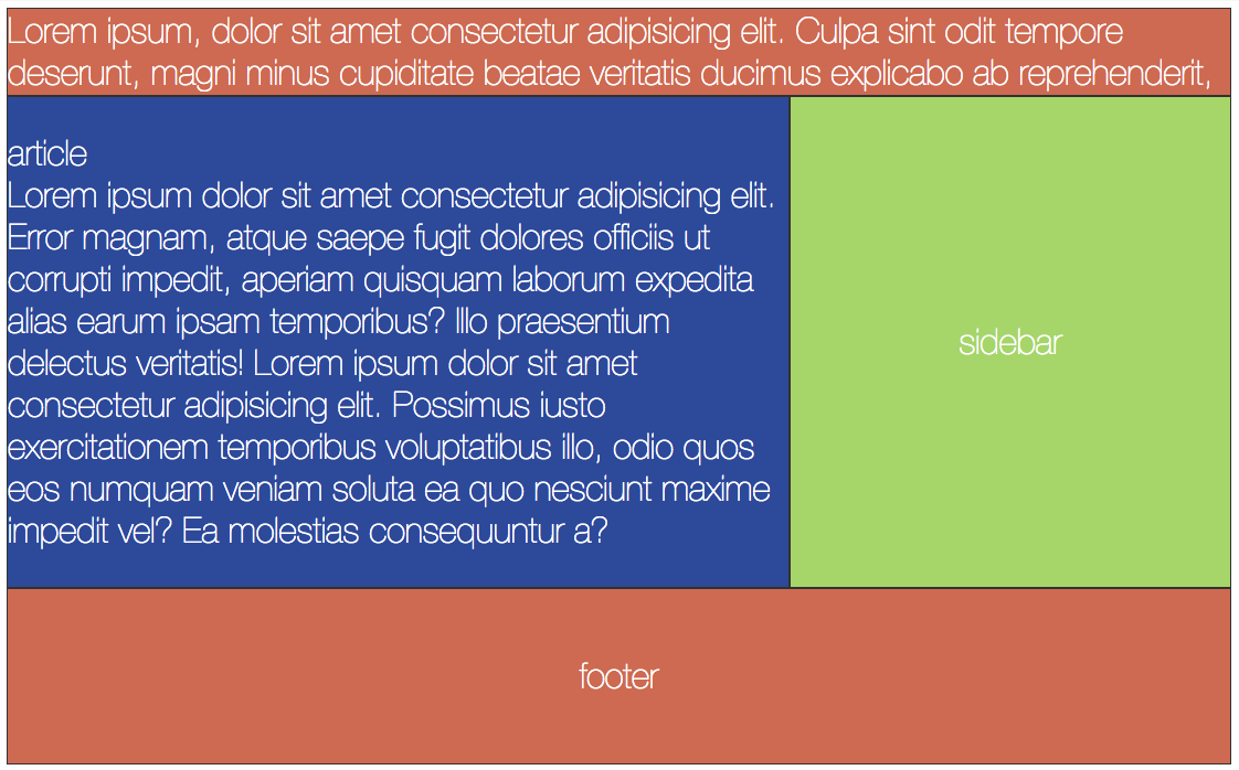
One way to extend this and see what happens is to add content to some of the elements. See what happens if you add a bunch more content to the header vs the article element. Here you will see how max-content comes into play.
As a side note adding content may produce some effects you're not expecting because flexbox is applied to the elements. If you want to see an element without flexbox then remove the .box class.
Example 7: Grid Areas
Using grid line numbers can get confusing. And if you change the number of columns then you will have to go back and redo everything.
Luckily there is another way. You can create grid areas.Like most of CSS Grid it can take a couple of tries to get used to these, but once you do it's my opinion that they are the easiest, most readable way to lay out the major sections of your site.
Template Areas are MUCH easier to use if you have sketched out the content areas of your site ahead of time and know how many rows and columns you have and what you are going to call the content areas covering those rows and columns.
In the grid below we've defined two columns and three rows:
    display: grid;
    grid-template-columns: 1fr 25em;
    grid-template-rows: 5em max-content 10em;
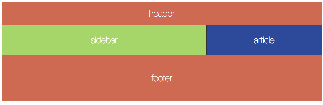
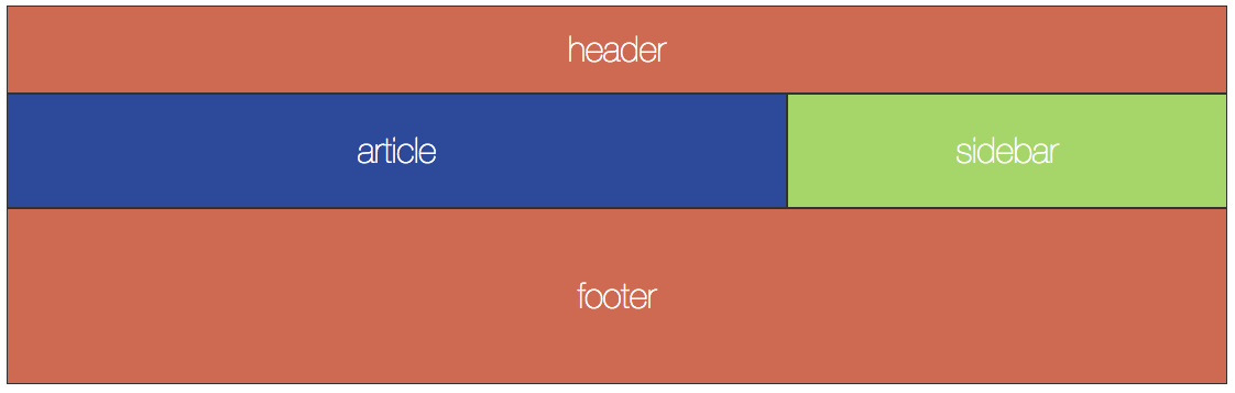
Let's say we want our site to look something like this:

In the first row the header spans both columns. In the second row the article is in the first column and the sidebar is in the second column. In the third row the footer spans both columns.
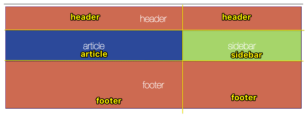
To define the grid area we will make one entry for each row. This is inside quote marks " " If you you don't put each row in quotes it doesn't work.
grid-template-areas:
      "header header"
      "article sidebar"
      "footer footer";
It may help to draw over your wireframes to help you see where the grid area names are needed. See the yellow lines and text below.
If you had six columns and wanted the header to span all six columns then you would write header six times like
"header header header header header header"
Now we can more easily put elements in thos grid areas we defined. Here we are using the classes of elements to associate them with an area:
  header{ grid-area: header; }
  article{ grid-area: article; }
  sidebar{ grid-area: sidebar; }
  footer{ grid-area: footer; }
Notice that quotes are NOT used this time.

See the Pen Basic CSS Grid: Template Areas by Christopher Stein (@profstein) on CodePen.
Extend Example 7
One interesting trick to try is to move areas around on the grid. If you reverse sidebar and article in the grid-area definition then sidebar will show on the left and article on the right.
You can also try adding in more elements and defining more grid areas to place them in, perhaps with more columns.